Menu Graphics
Graphical Representation of Measurements and Regression Profiles
For any material there are different types of material data that can be shown in diagrams. These are:
- Viscosity
- Thermal conductivity
- Enthalpies
- Densities / spec. Volumes
There are different options for the graphical representation:
- Graphical display of the measurement values
- Graphical display of the profile based of the repression profiles
- Display of the measurement values and the regression profiles
If neither a regression profile nor a series of measurements is available, no diagram can be generated.
If there are measurement values for a type of material data (e.g. viscosity) these are shown (item 1. or 3.). If model parameters are available – either entered manually or determined by means of a regression – the regression profile is shown as well. The equation for an approximate curve results from:
- the material data which has been entered manually or
- the regression result and its relating measurements (of the material type)
It is important to note that each measurement series belongs to a specific measurement type and each regression is performed on the basis of exactly one measurement type. (In this case, measurement type refers to a data set that includes, for example, three curves at different temperatures for viscosity).
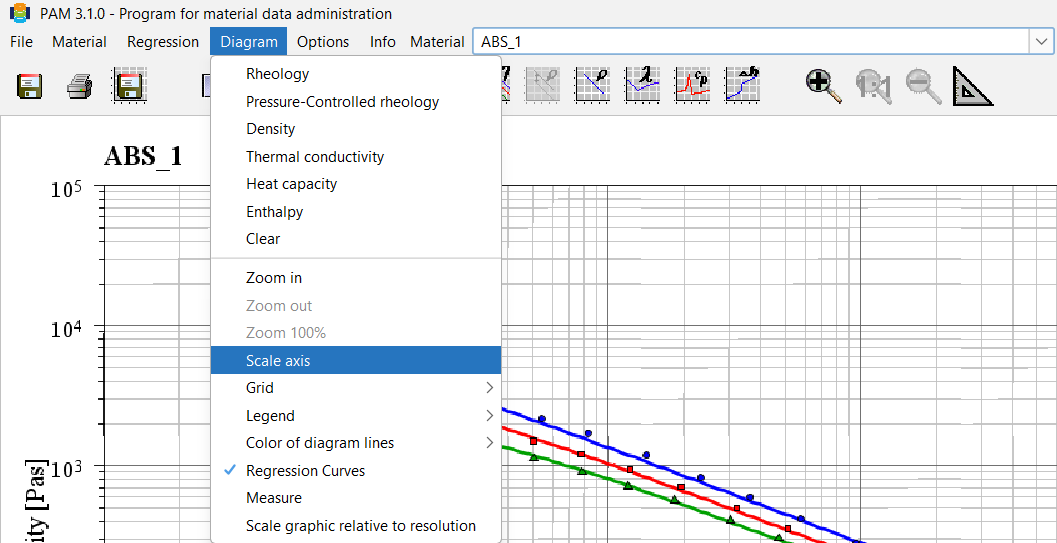
PAM offers the option of scaling existing graphs. To do this, select the Scale axis function in the Diagram menu item.
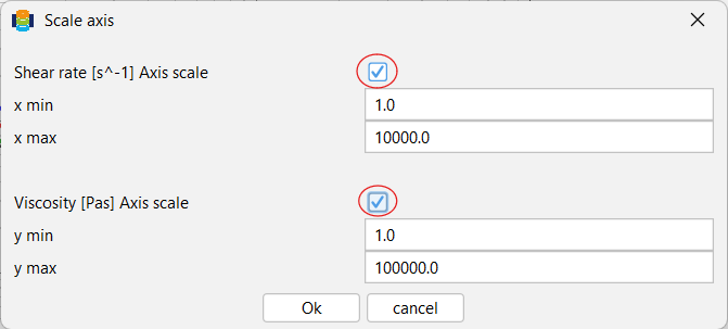
In the dialogue box shown on the right, you can now adjust the intervals for the x-axis and y-axis. To do this, however, you must first activate the checkboxes next to the dialogue box.